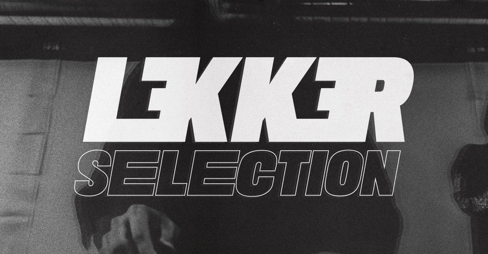
Lekker Selection
Lekker Selection · 2023-Present
Brand Strategy, Identity Design, Event & Flyer Design, Web Design, Merch Design
Lekker Selection is a Philadelphia production company for underground bass music. The founders came with a name and a vision. I built the brand and the digital strategy from zero: the identity, the merch, the event flyers, and the website. The identity works on a garment first. The merch turns fans into the community. The numbered flyer series gives each show a ritual. The website ties it all together and runs the events. The brief was clear: capture the European underground scene the founders admired, with community at the core. My creative strategy was to build Lekker as a streetwear brand, not an event promoter, and to keep it underground so it would spread by word of mouth.
The Challenge
A company that did not exist yet
There was no audience, no identity, and no digital presence. Everything started from zero, before the first event.
Build a community, not just a look
The goal was a brand people want to represent. That is harder than a logo. It needs a reason to belong and something to wear.
Feel underground, spread on its own
The brand needed credibility in the scene from day one. It also needed to travel by word of mouth, not paid promotion.
Run a series once it starts
Each show would need a flyer, a ticket link, and a photo gallery. The system had to support a growing calendar without manual work each time.
The core problem
How do you launch a brand-new company as a streetwear-style community, and give it systems that scale as the events grow?
Strategic Approach
Position it as a streetwear brand
I treated Lekker as a label people join, not an event promoter. The identity had to work on a hoodie before a flyer, so I chose a brutalist, high-contrast direction: heavy type, hard edges, and one accent color. The look reads as native to the scene and travels by word of mouth.
Build for repetition
Lekker runs a recurring series, so I designed the brand as a kit, not a single layout. The logo suite, textures, and flyer layout reuse across every show. Each new event stays on brand without starting from zero.
The Solution
1. Brand Identity
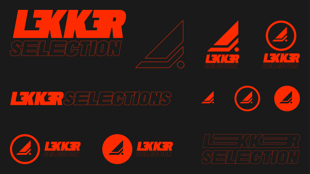
Logo suite
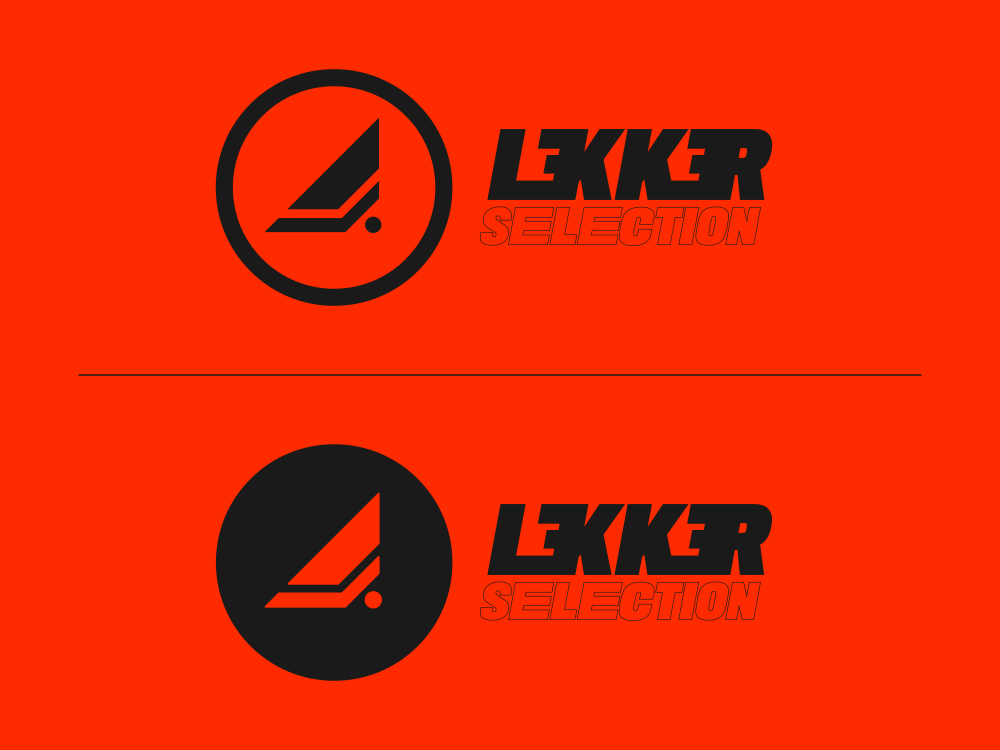
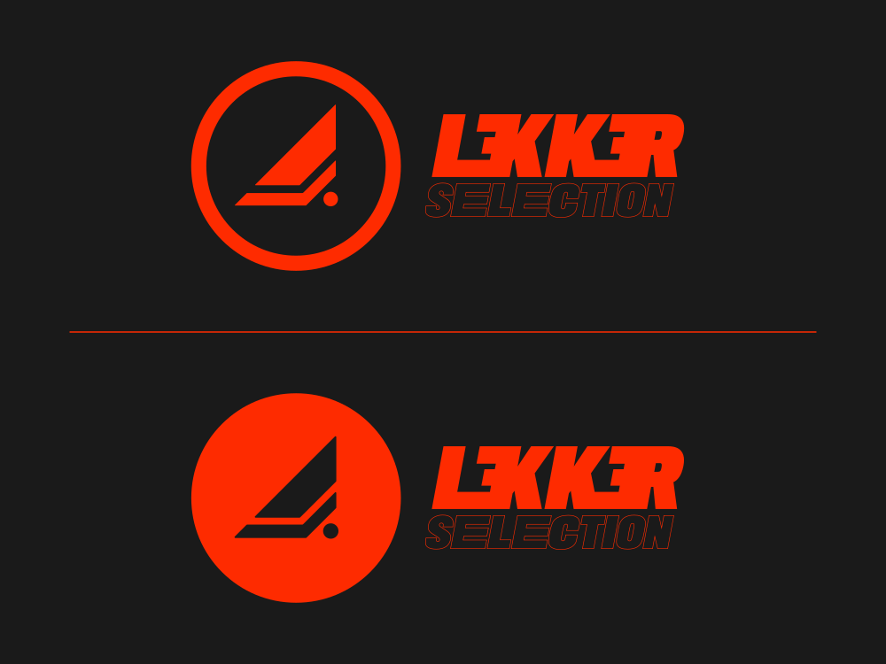
The mark system works in every context. It includes a standalone icon, vertical and horizontal lockups, and the wordmark on its own. Each version comes in full-color, mono, and knockout forms for light or dark backgrounds.
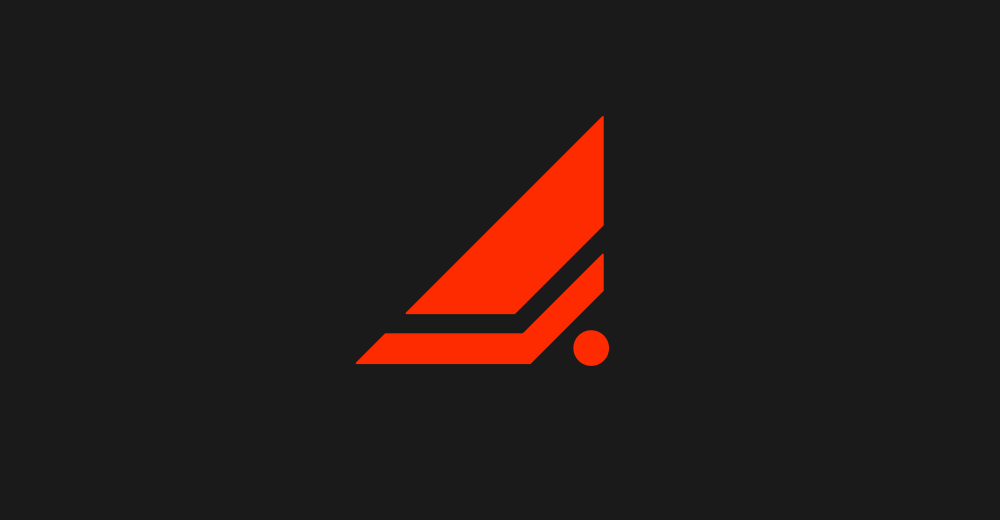
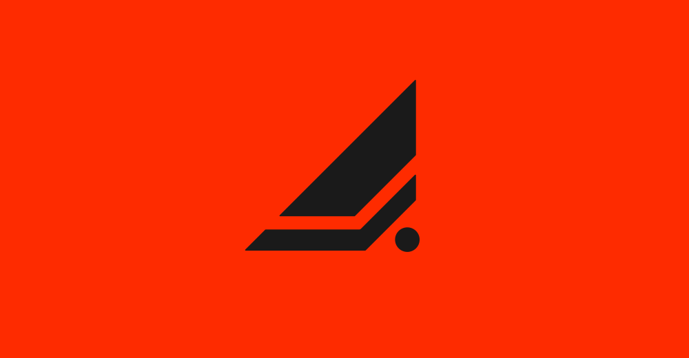
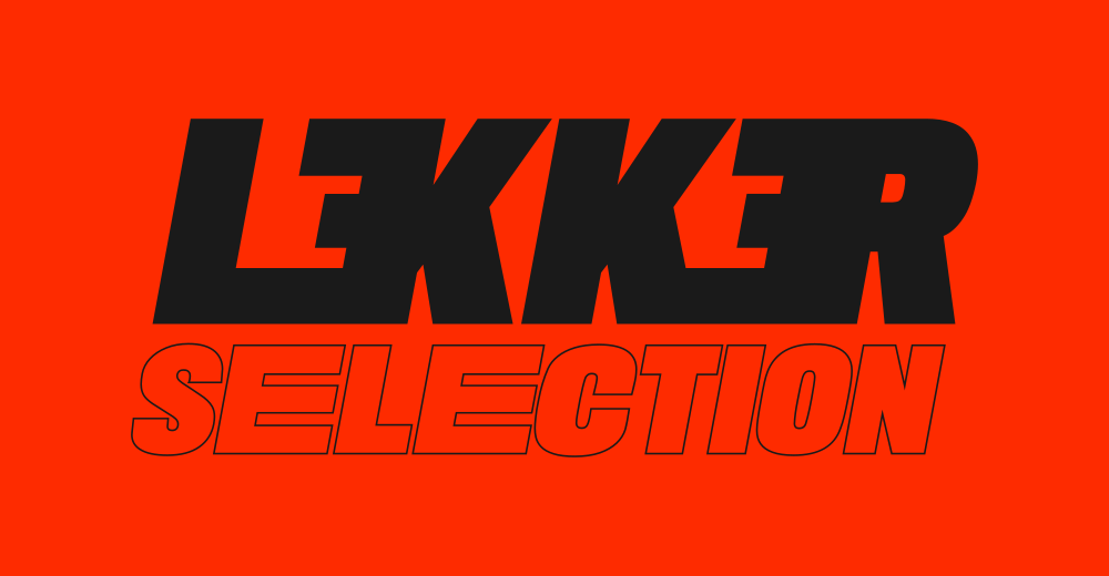
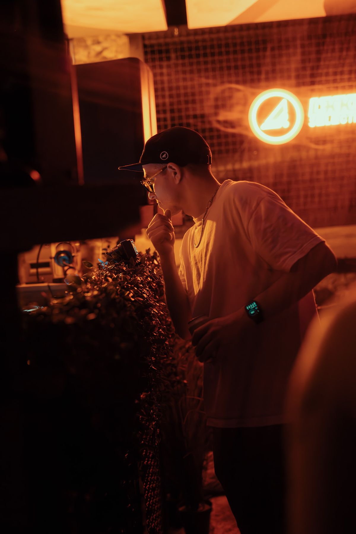
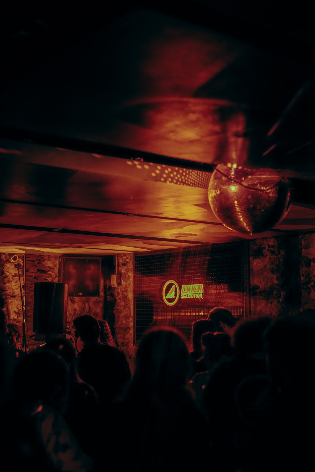
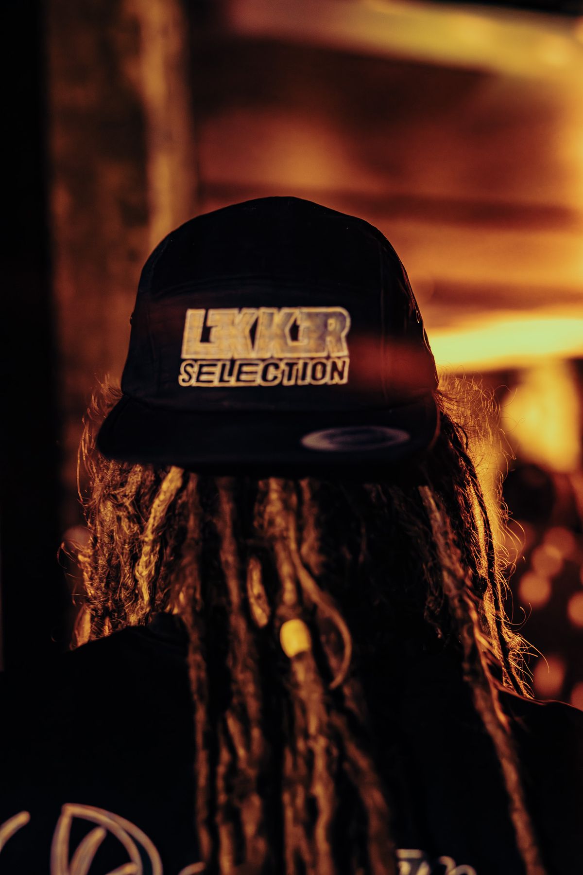
The wordmark
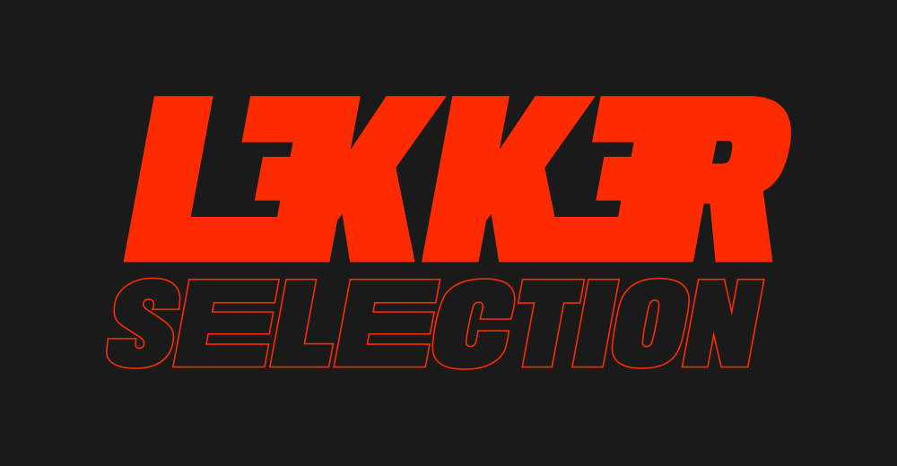
The wordmark reads as coded and native to the scene. It works on a hoodie, hat or a wall.
Texture system
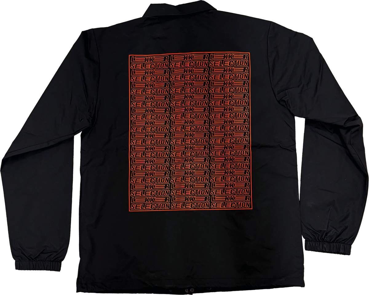
I built the brand name into a repeating texture. It ships in black, orange, grey, and white. The team uses it across digital and physical applications.
2. Merch (the community engine)
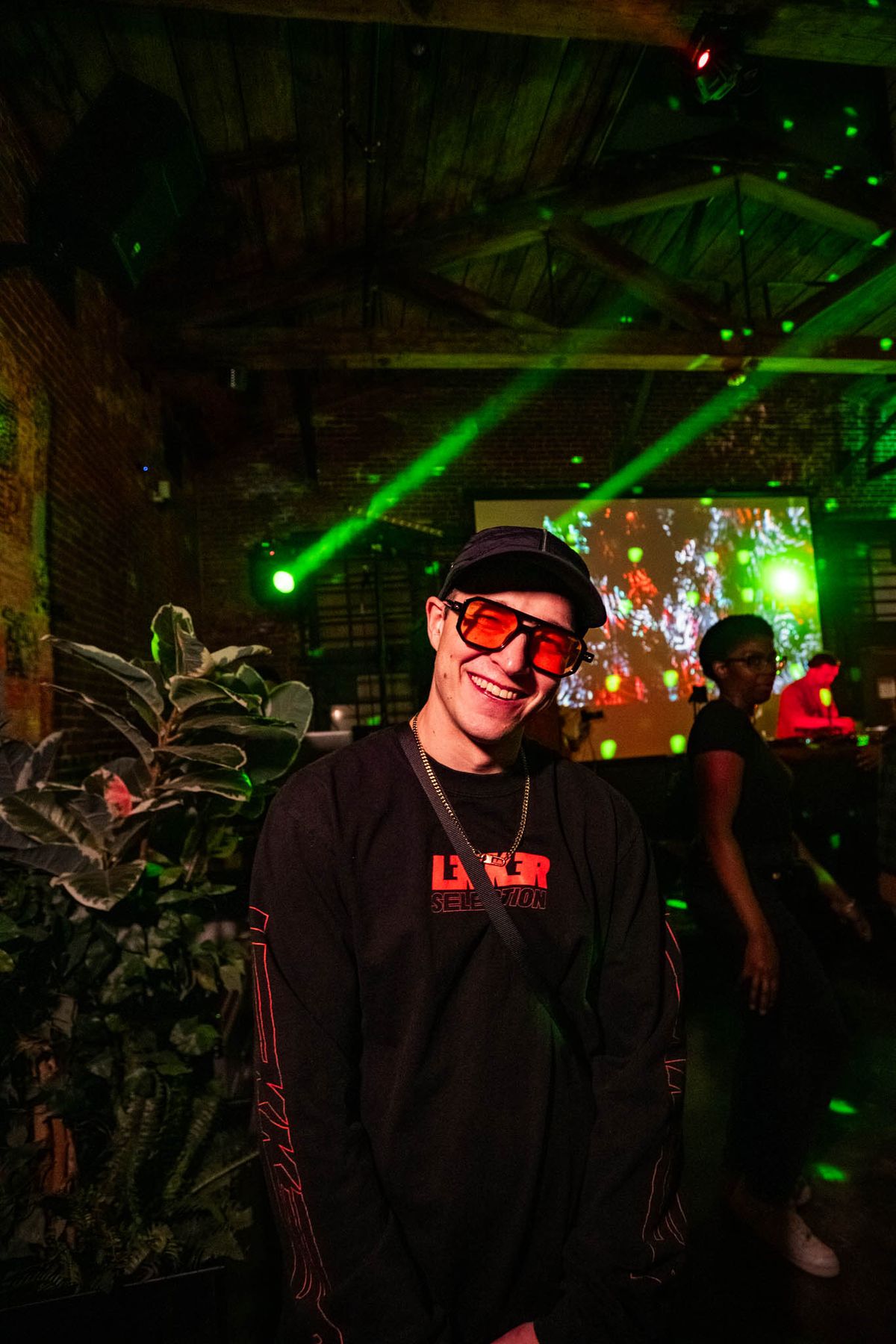
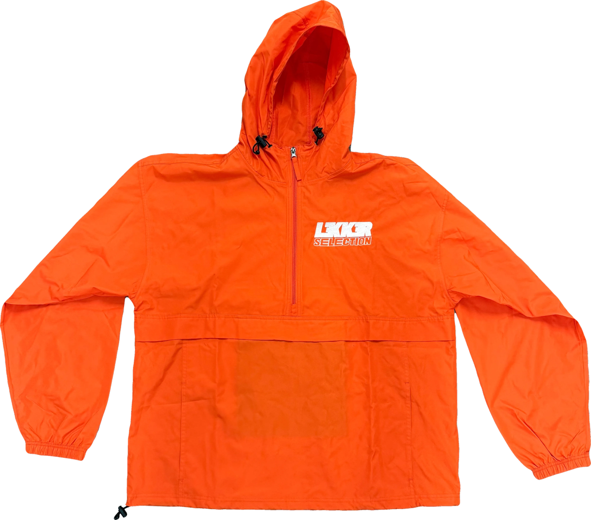
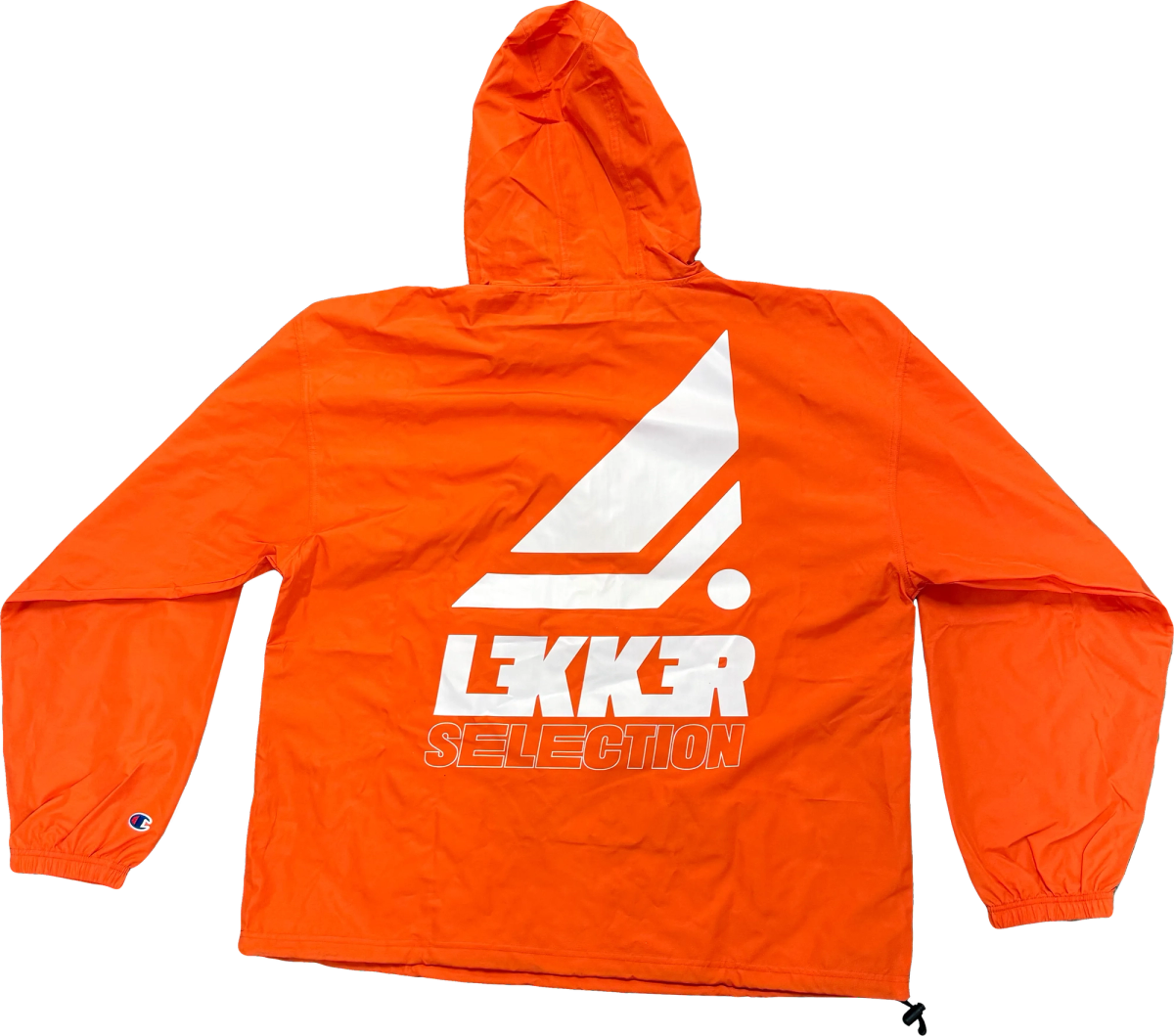
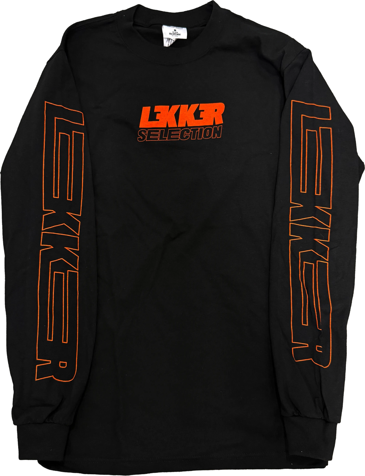
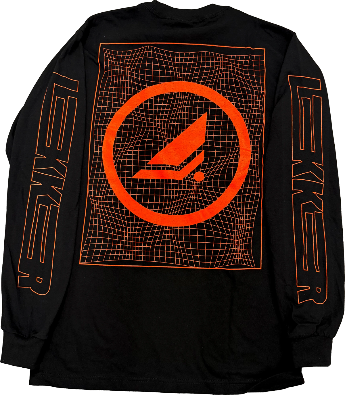
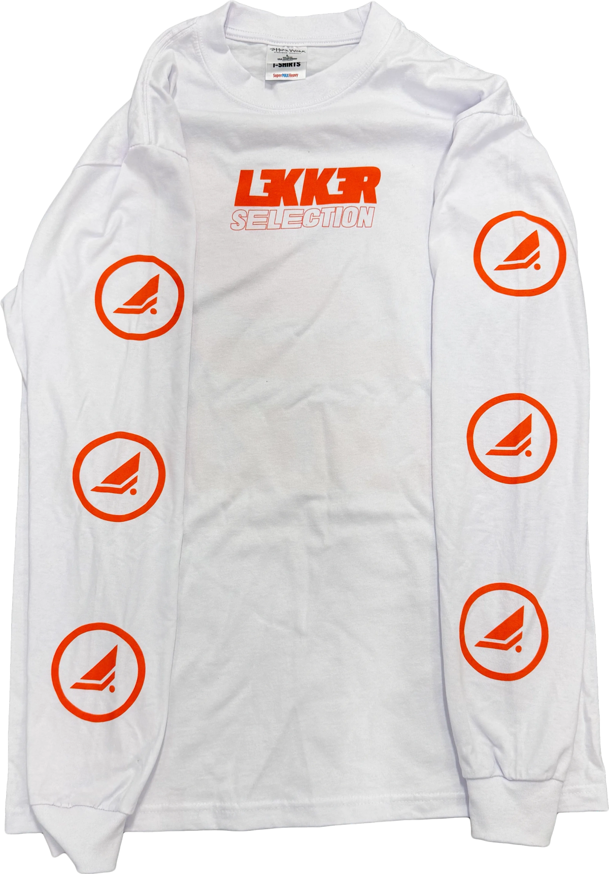
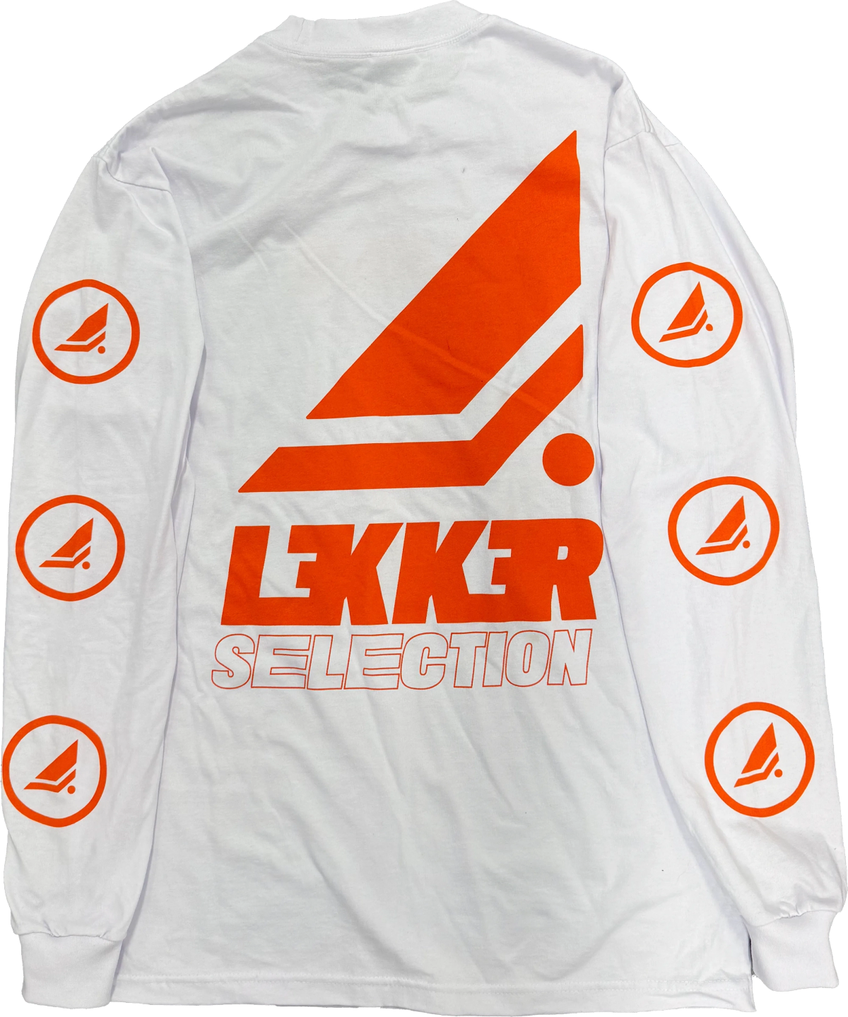
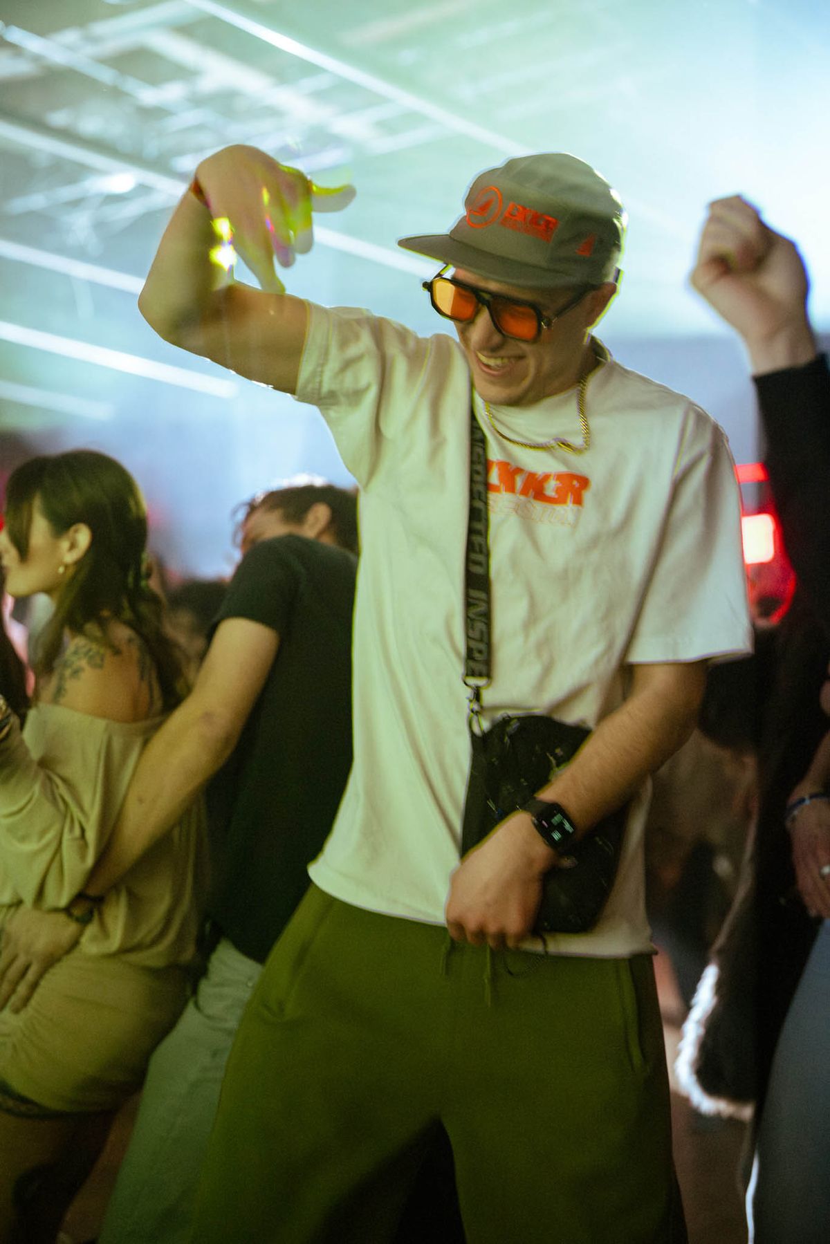
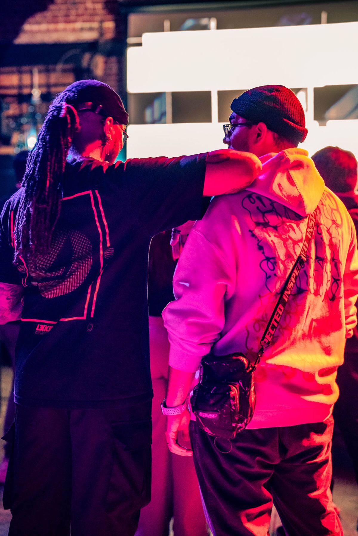
Merch is how people join Lekker. Whether it be a poster they can take home, or merch they can wear. I designed the drops with the wordmark and texture system so fans want to wear them. Each piece turns a fan into a member and a walking sign for the next show. This is the core of the community strategy, not an afterthought.
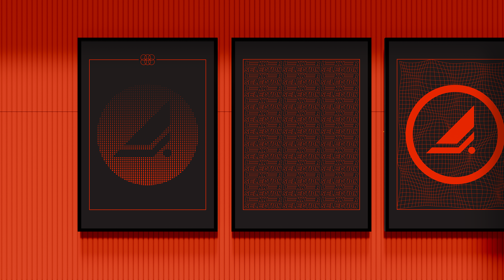
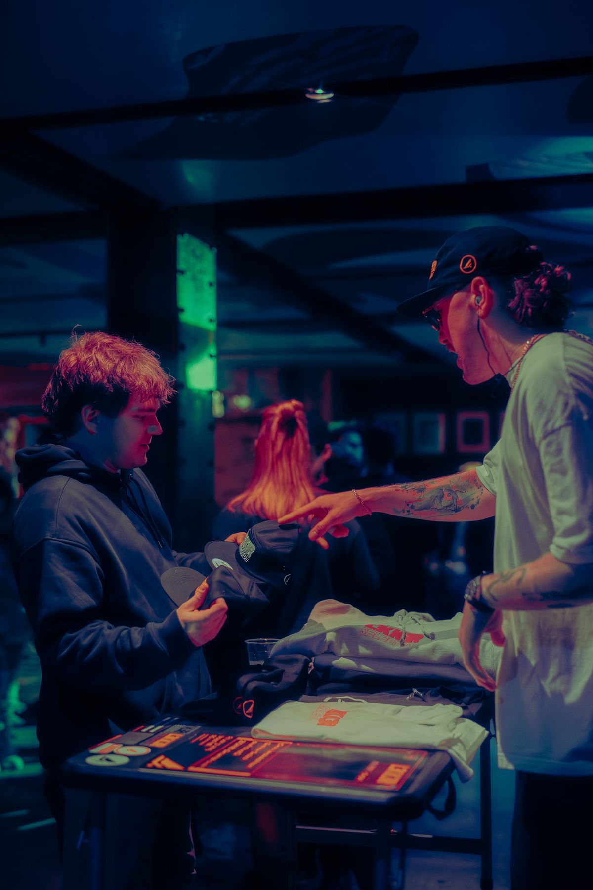
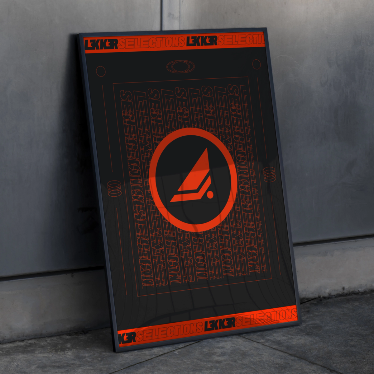
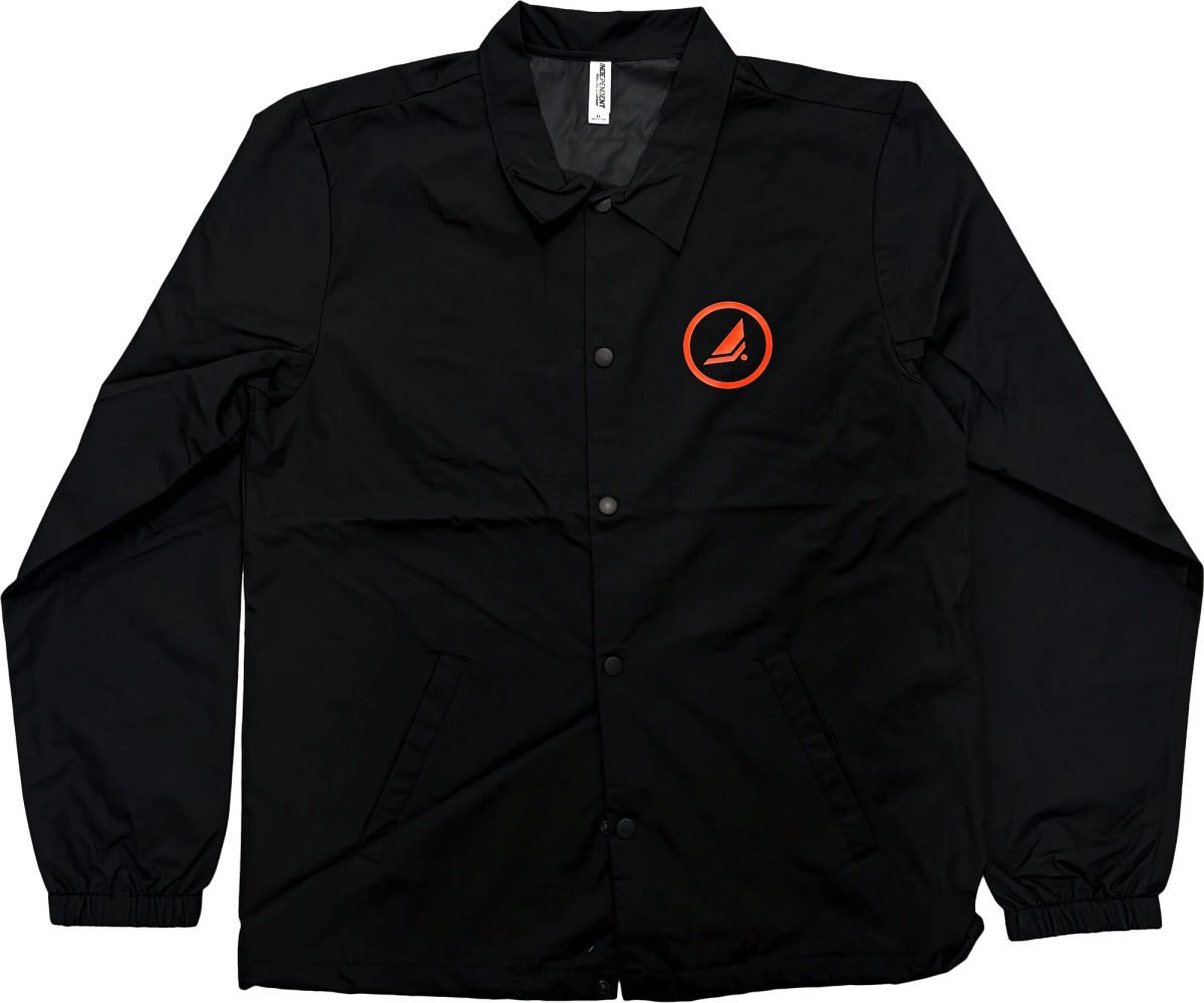
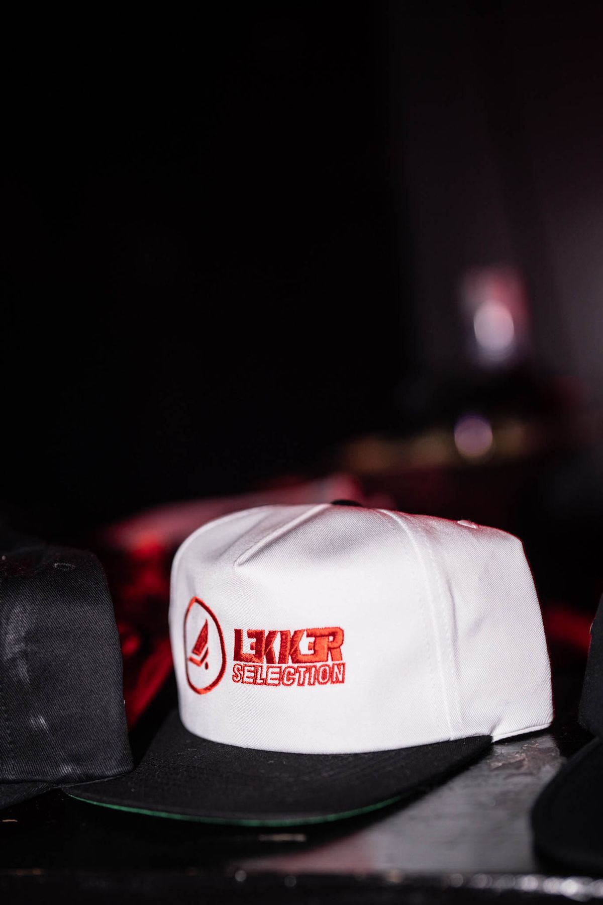
3. Event & Flyer Design (the ritual)
Each show gets a flyer in one consistent style. The type treatment, texture, and palette stay the same. The lineup and mood change per event. Each event also gets its own numbered LKS logo, so the series reads as a set that fans collect and recognize. I built the flyer as a template across formats: Instagram post, story (9:16), Resident Advisor, Facebook cover, and 11x17 print.
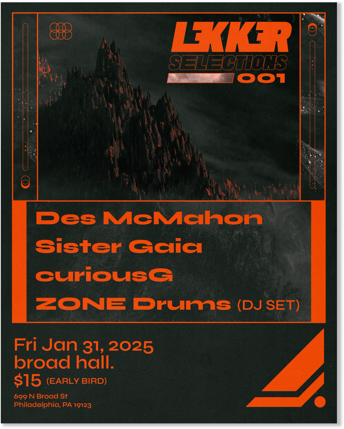
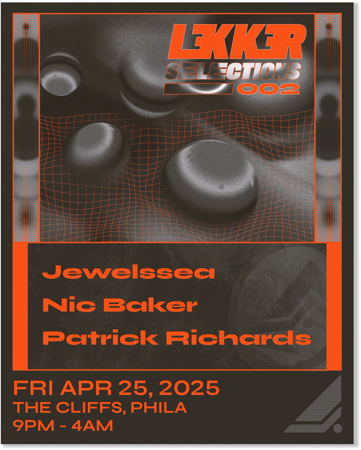
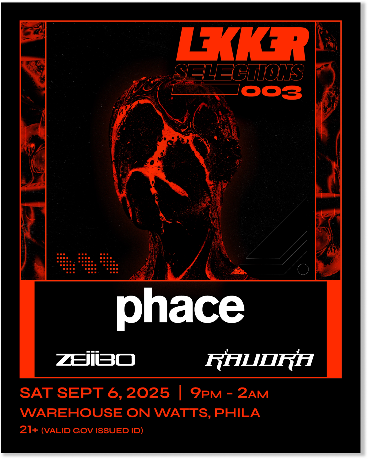
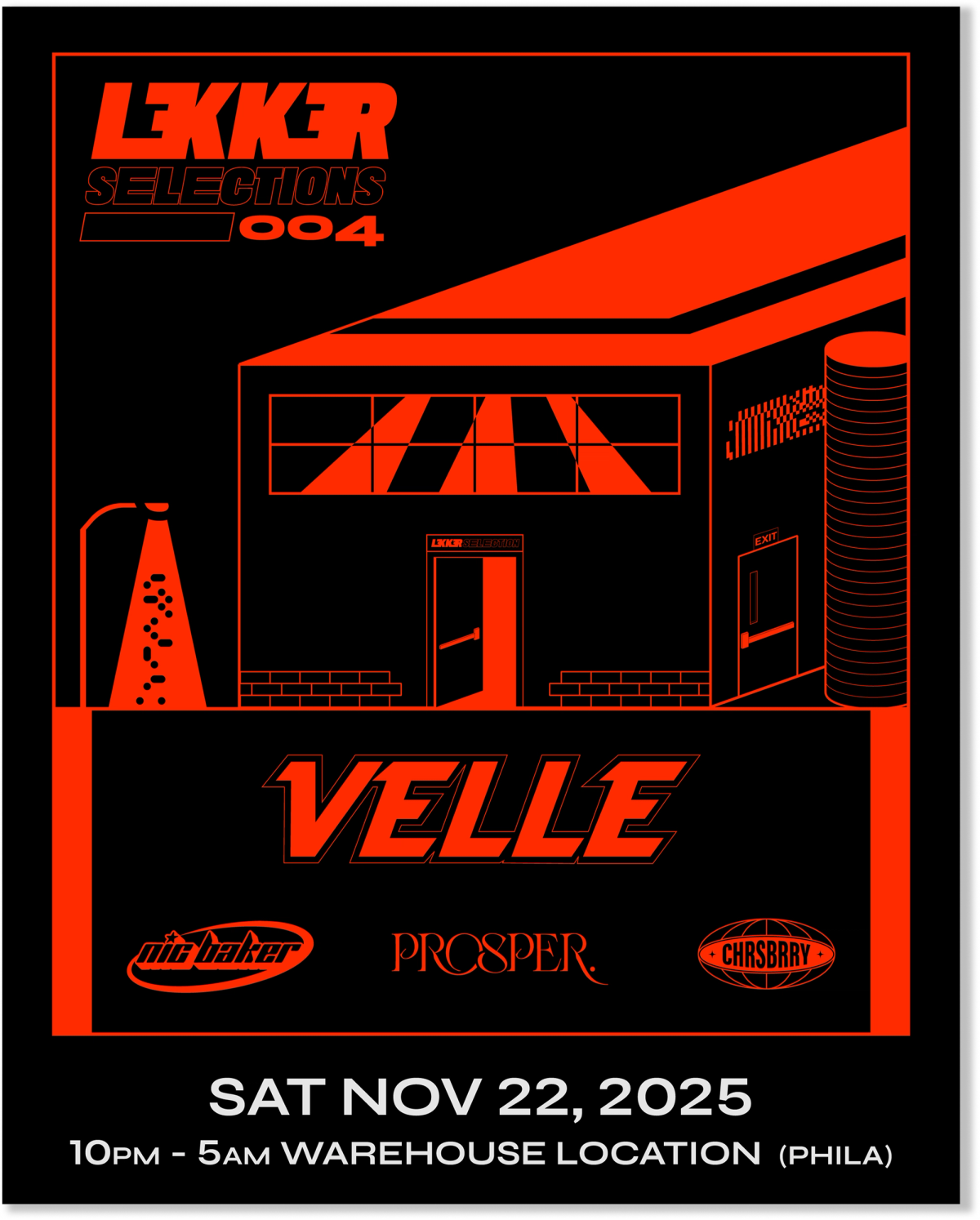
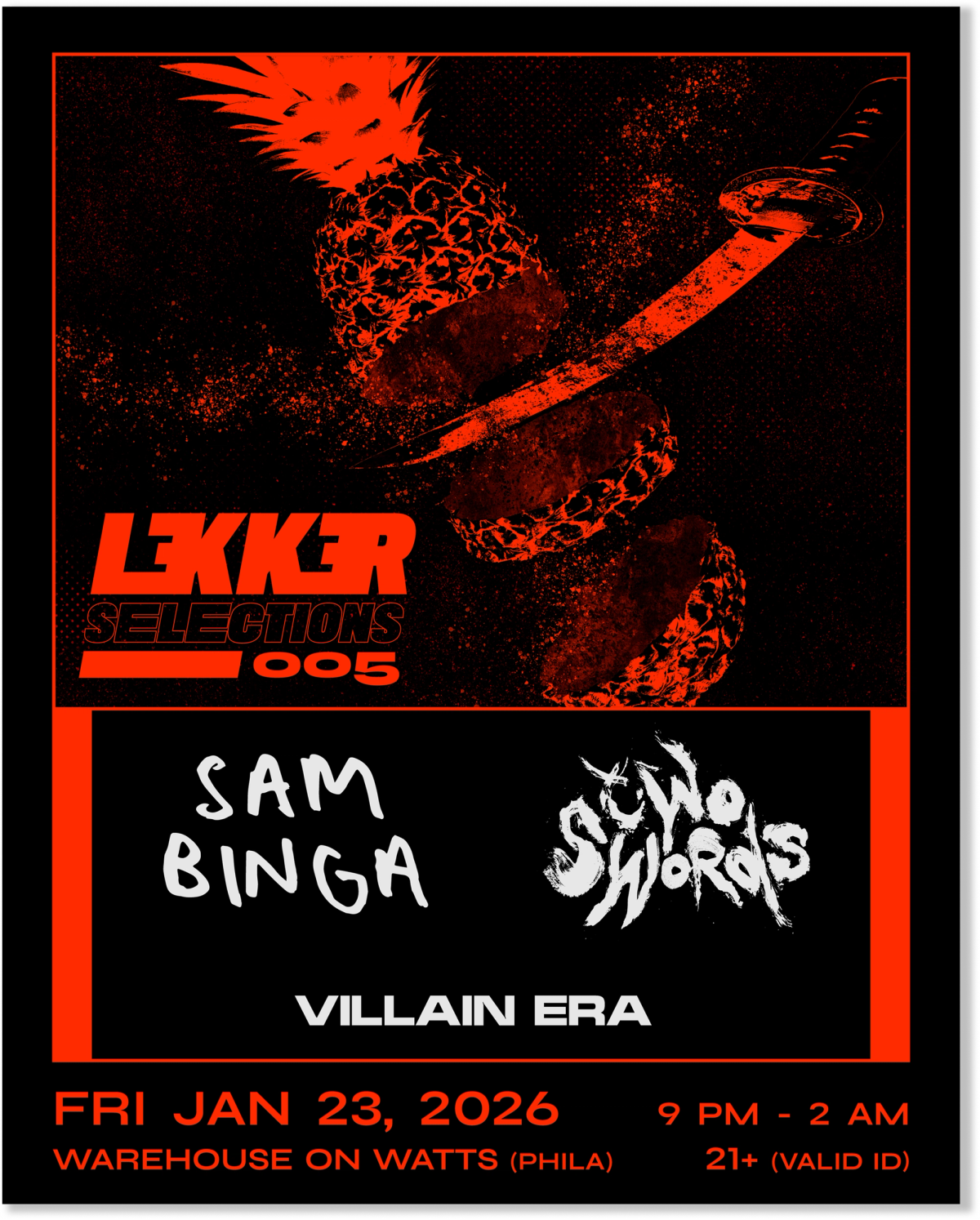
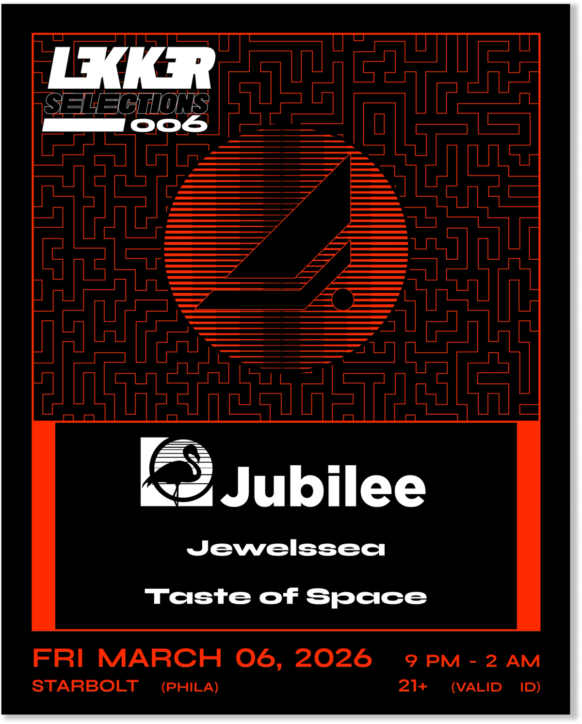
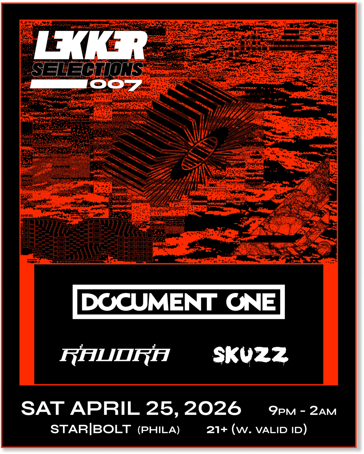
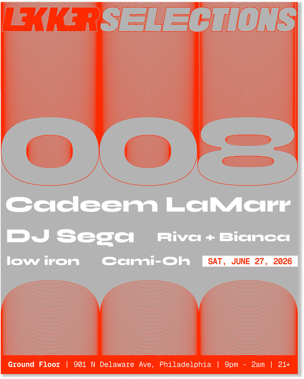
Depending on the genre and vibe of the show, colors and imagery can change while keeping the core of the brand’s design language.
Artist Spotlight
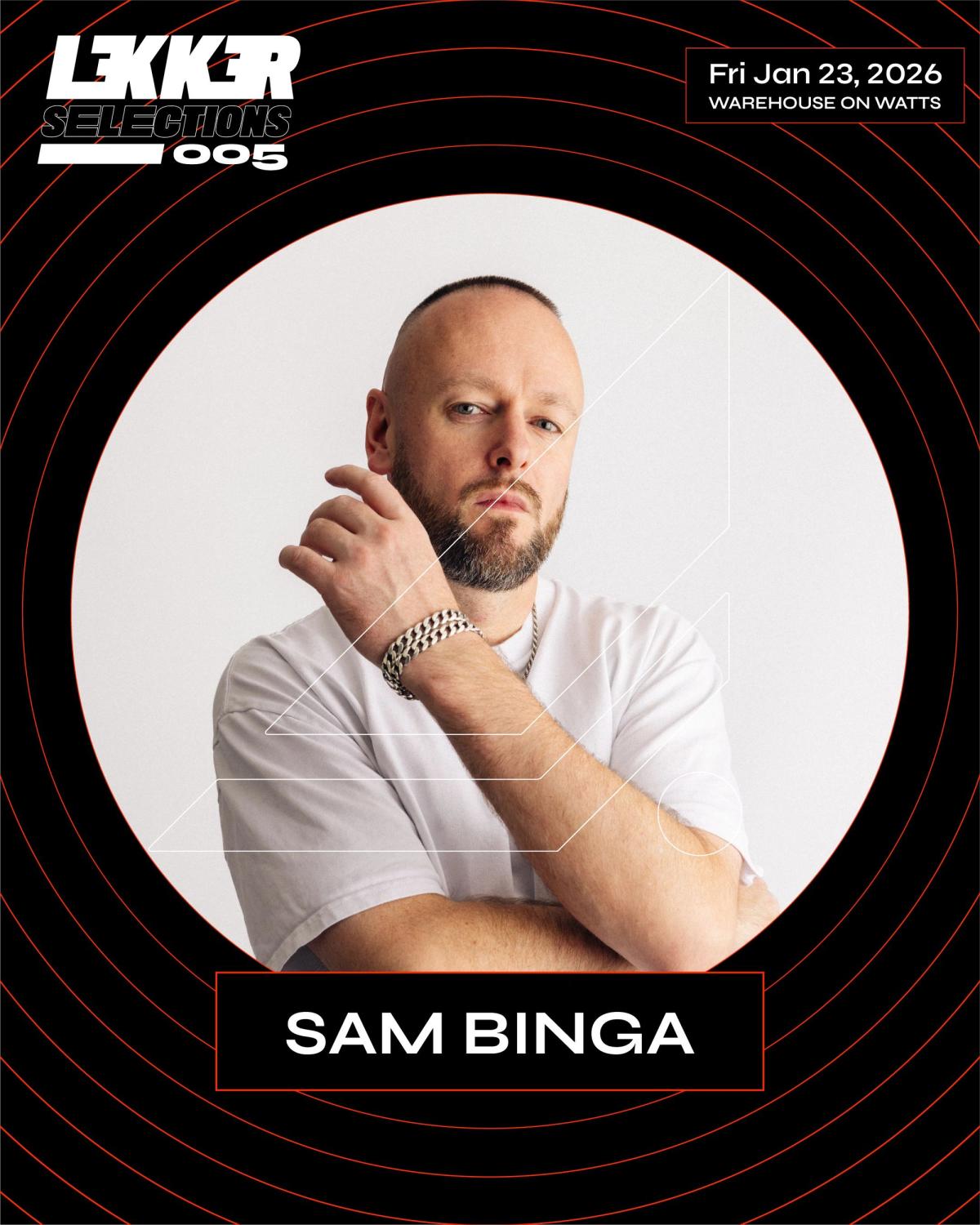
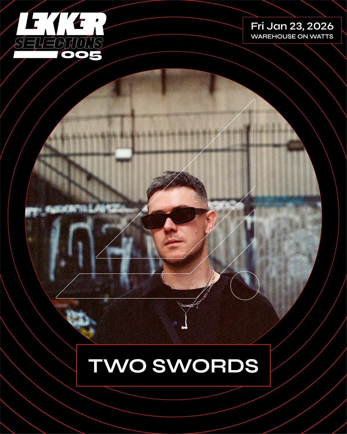
4. Website (the hub)
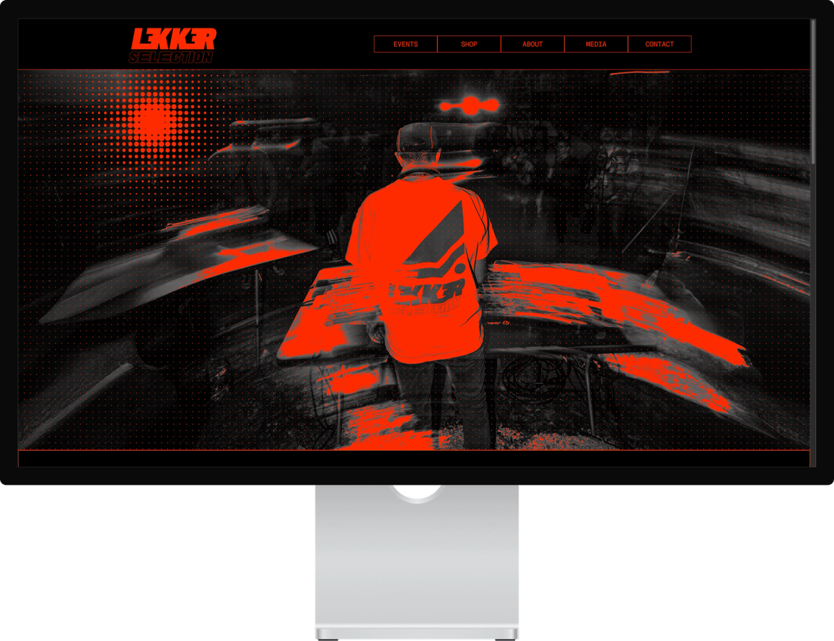
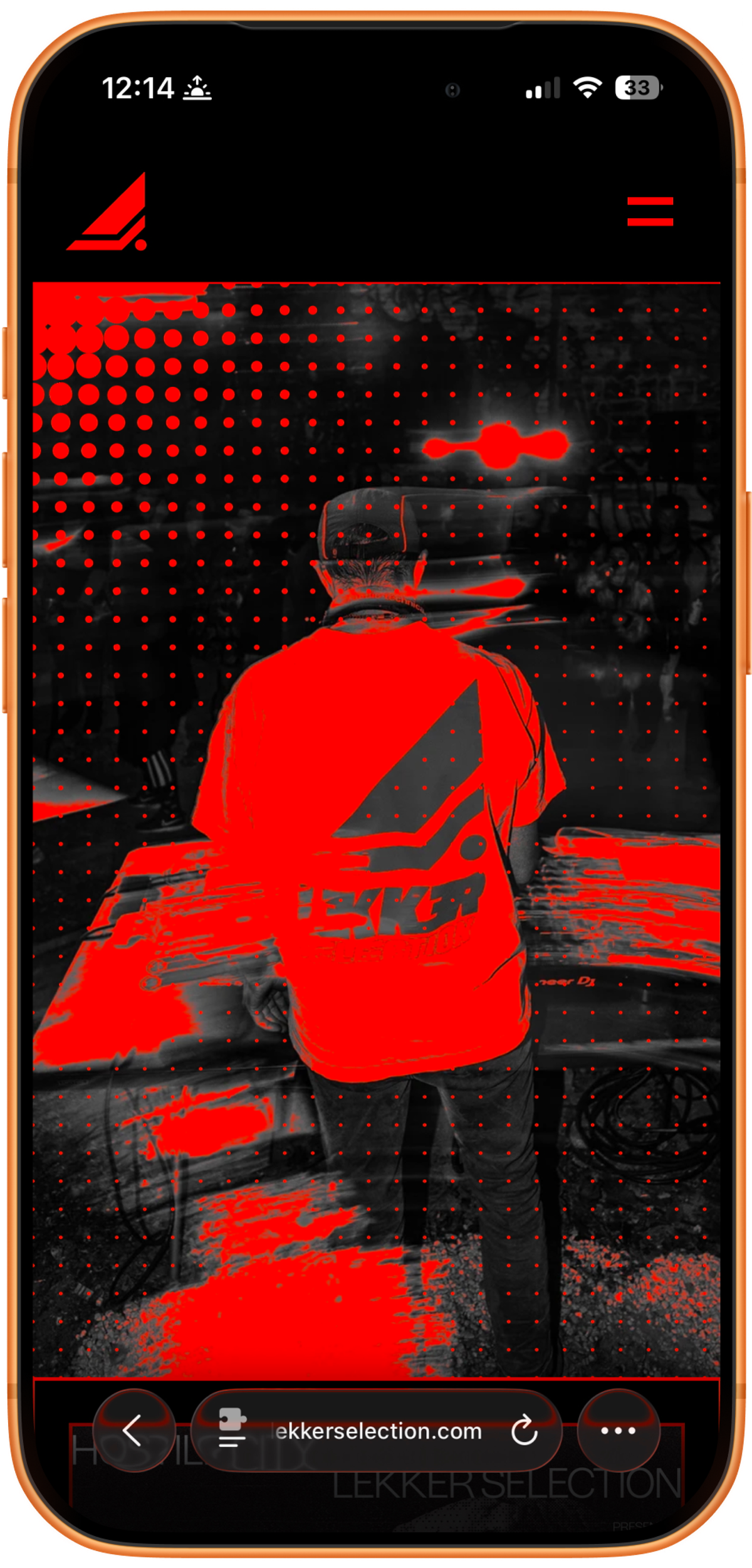
The Framer site is the owned home for the brand and a huge piece of the project. It works as a fan destination and as a light tool that runs the events.
Pure black background
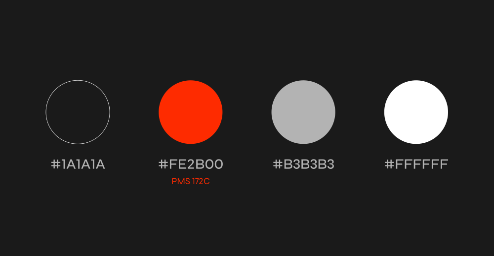
The brand black is #1A1A1A. For the website I used pure black (#000000) instead. I wanted the highest contrast and the darkest feel. A screen at pure black does not blind the people next to you in a dark club. The dark page also builds suspense and mimics the room at the event.
Platform and structure
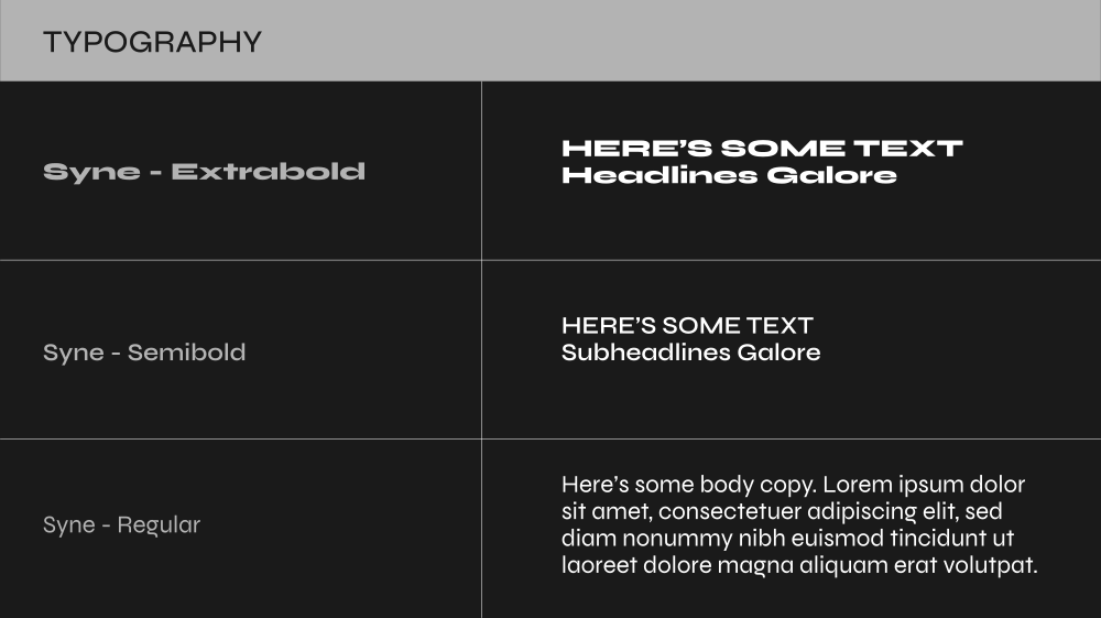
Platform: Framer, with a CMS-driven event structure. Pages: Home, Events (index and detail), Media, Shop, About, and Links. Type: Syne for display, Geist Mono for event data and UI labels.
A homepage that tells the whole story
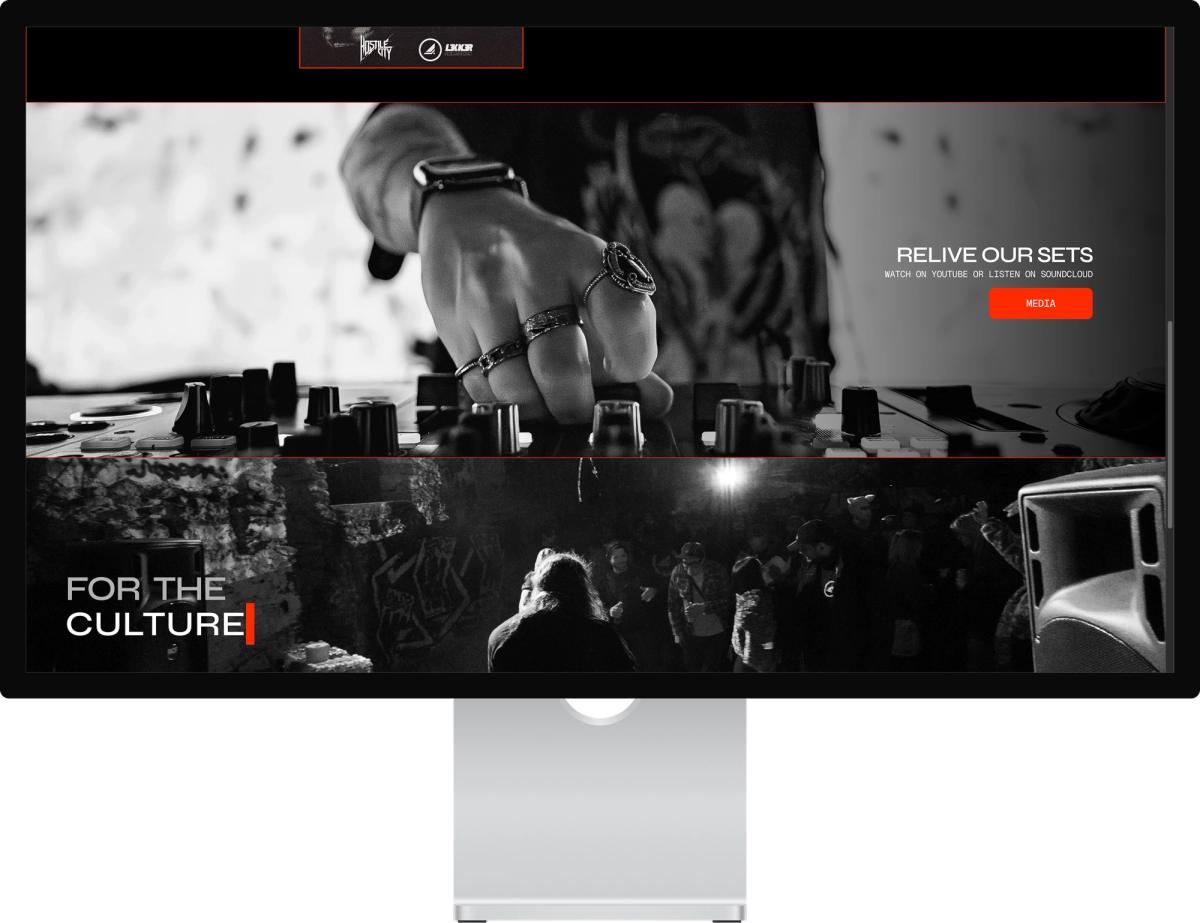
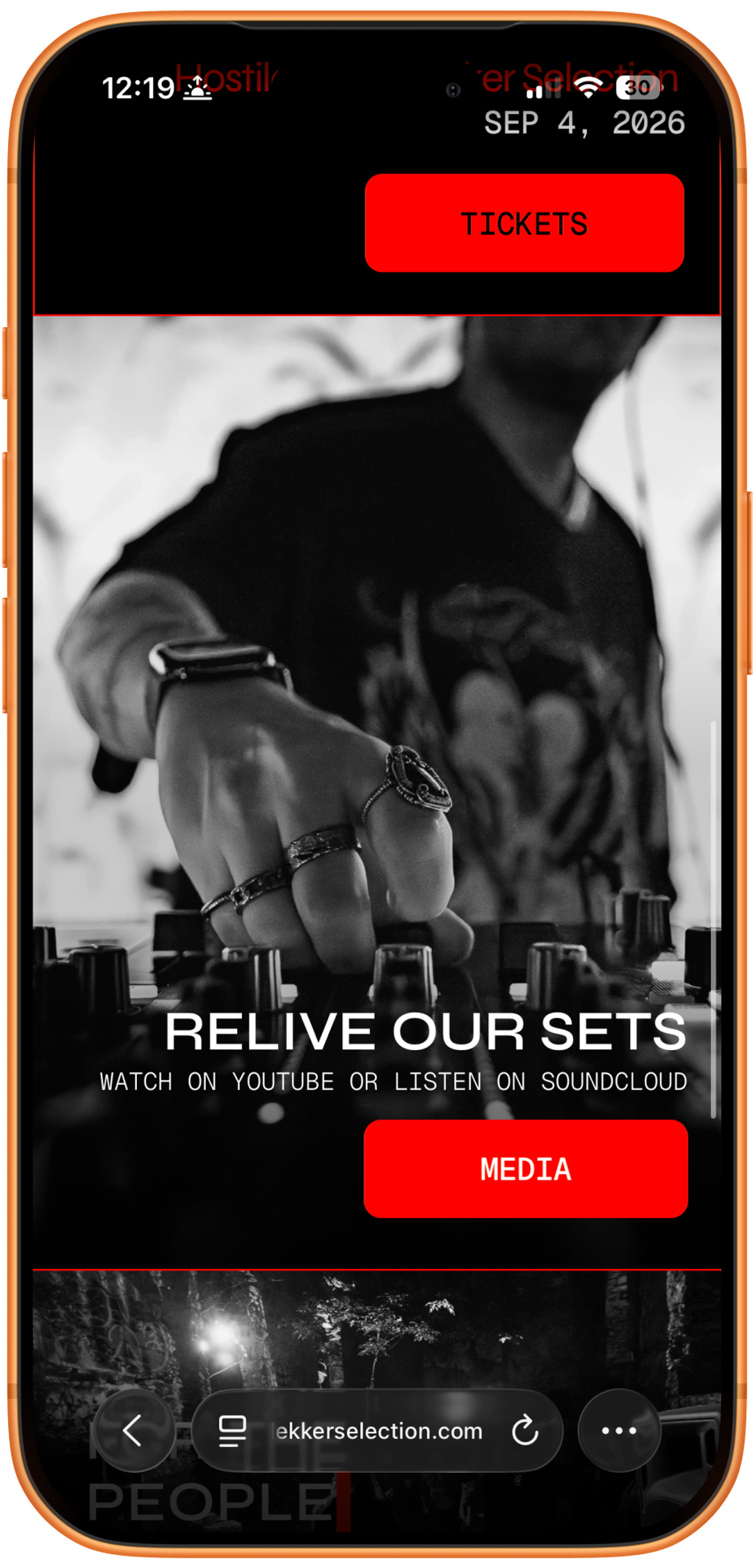
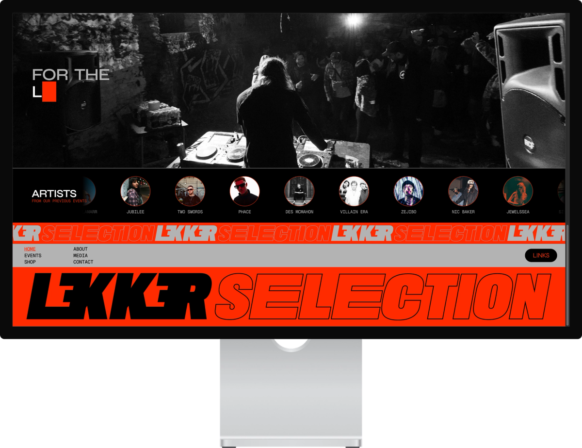
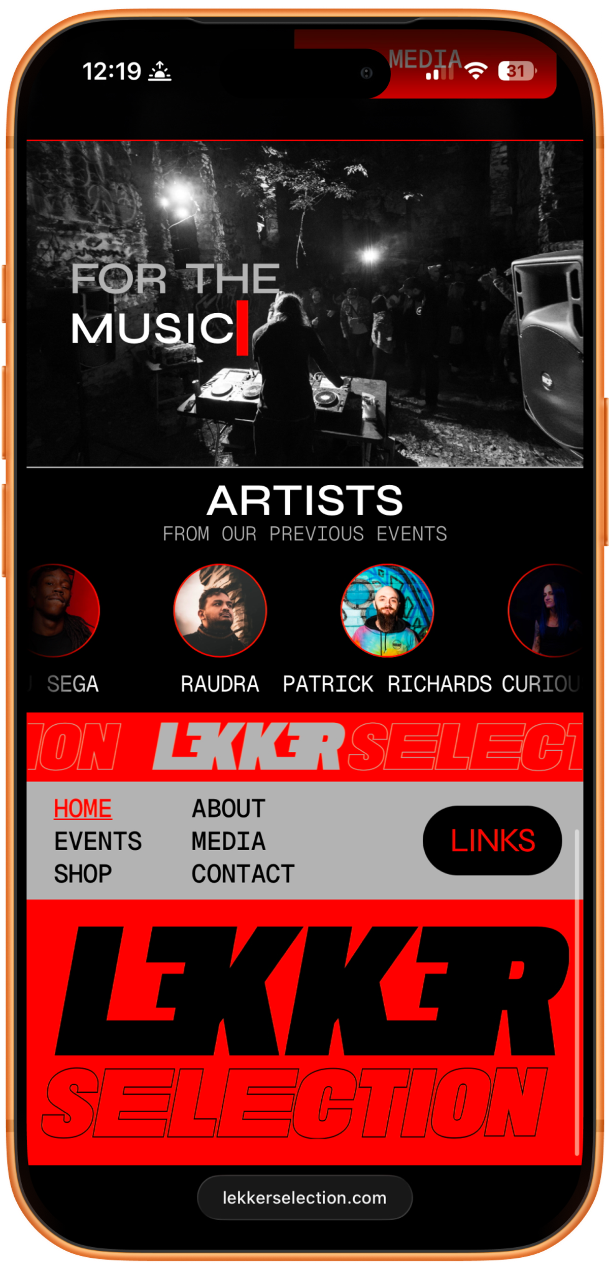
The homepage works as one scroll. Each section pulls from the CMS and links to a deeper page: a featured event, an about snapshot, an artist cloud, past-event teasers, a merch promo, and a media highlight. New events and products appear here as the team adds them.
The event engine
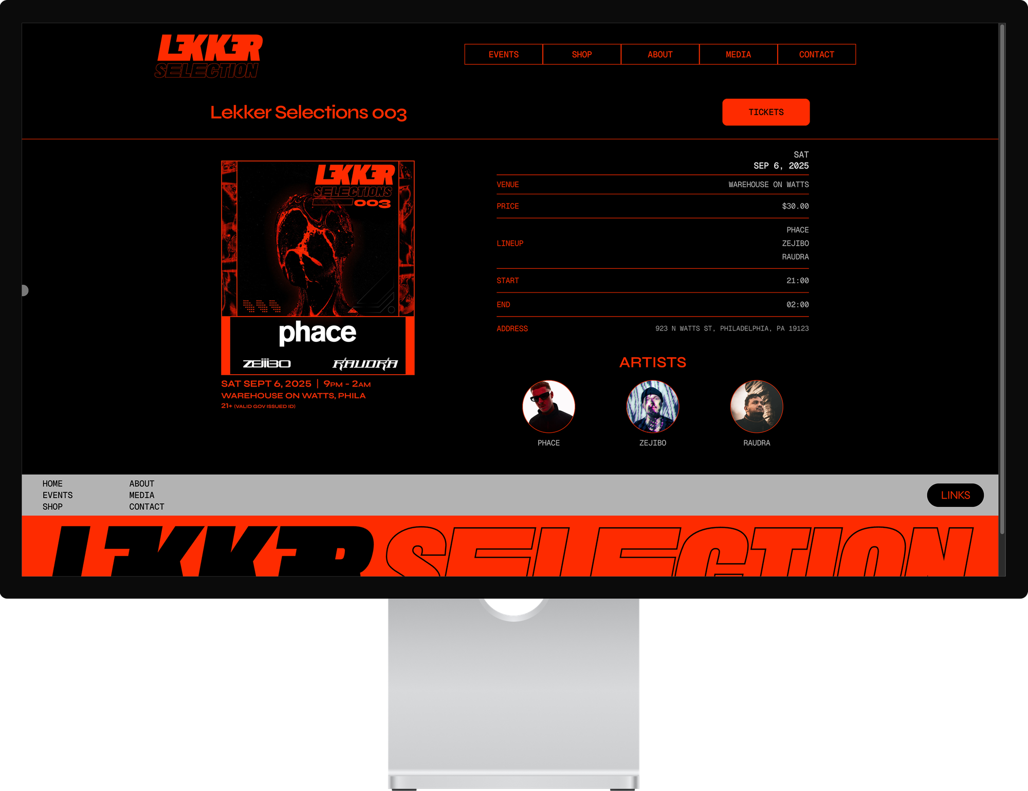
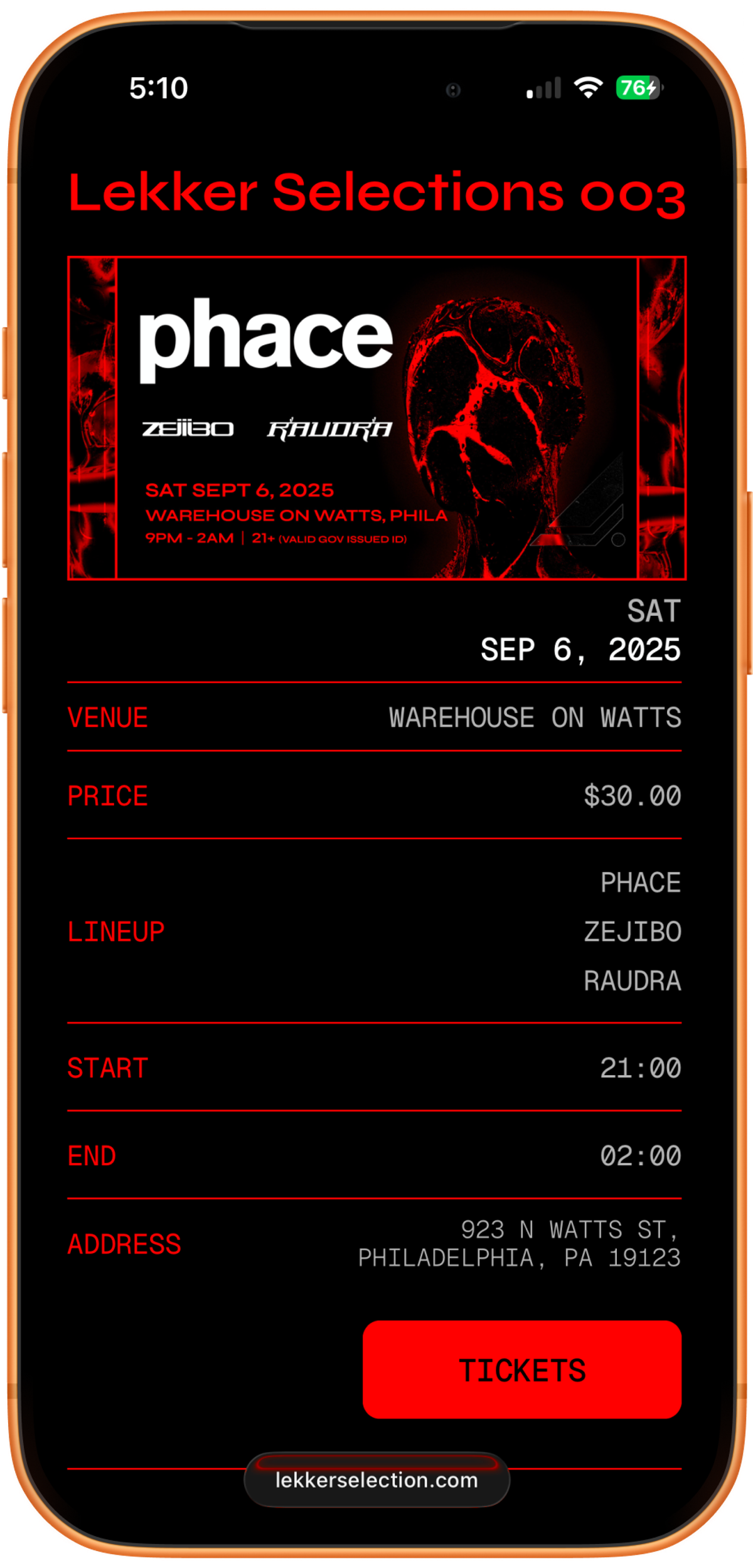
Every show follows the same structure, so I built the events as a CMS collection. Each entry creates its own event page. The fields cover title, date, time, venue, address, price, ticket link, flyer, thumbnail, lineup, and a post-event gallery. To add a show, the team fills in the fields. No design work is needed. Artists live in their own collection and link across events, so the team adds each artist once.
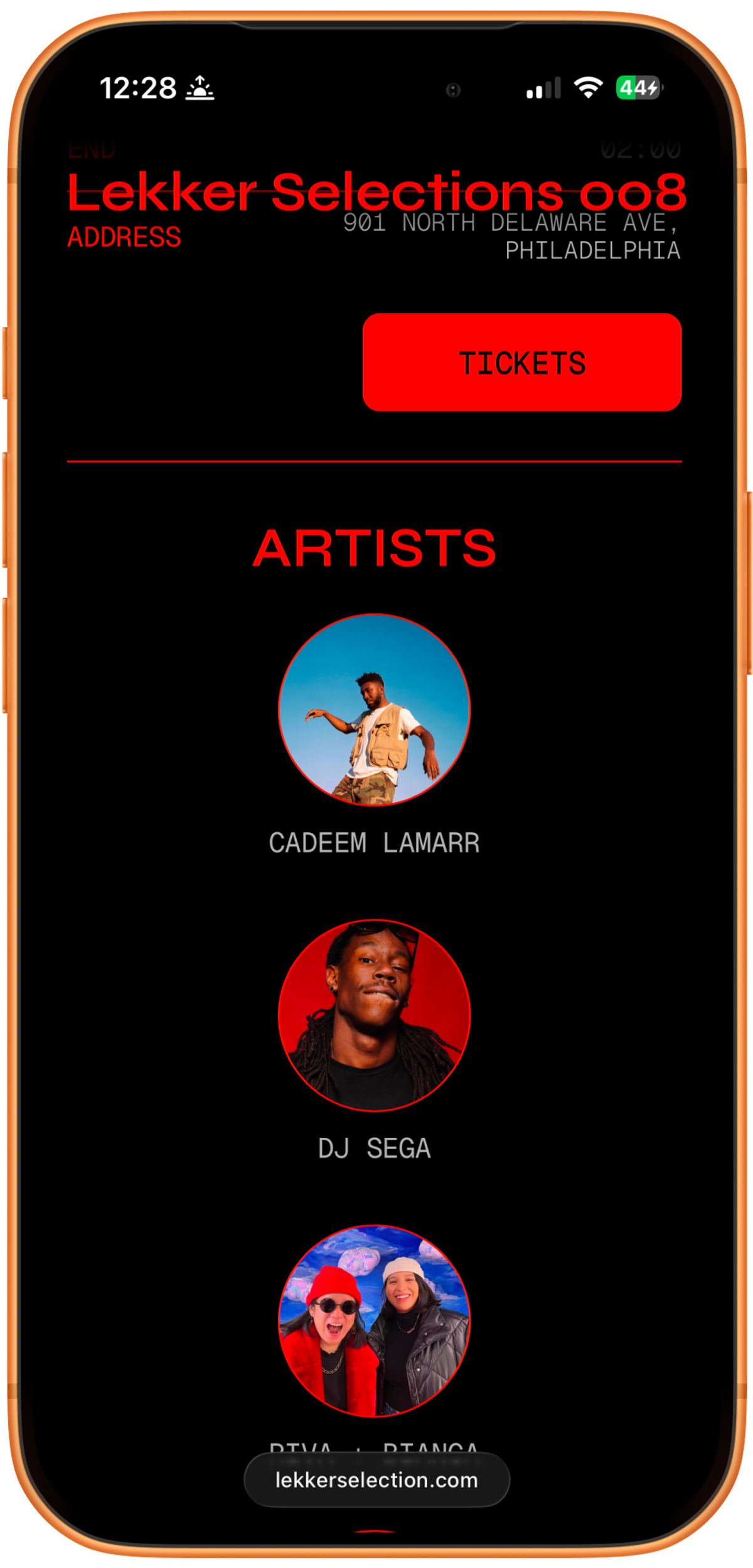
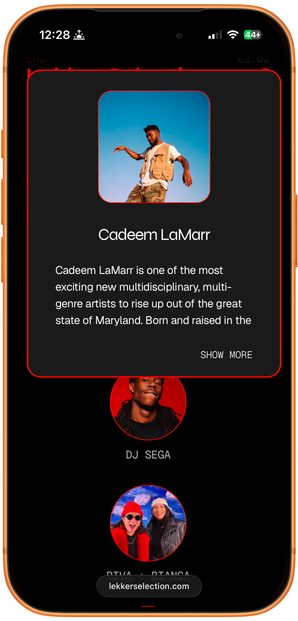
The /latest QR system
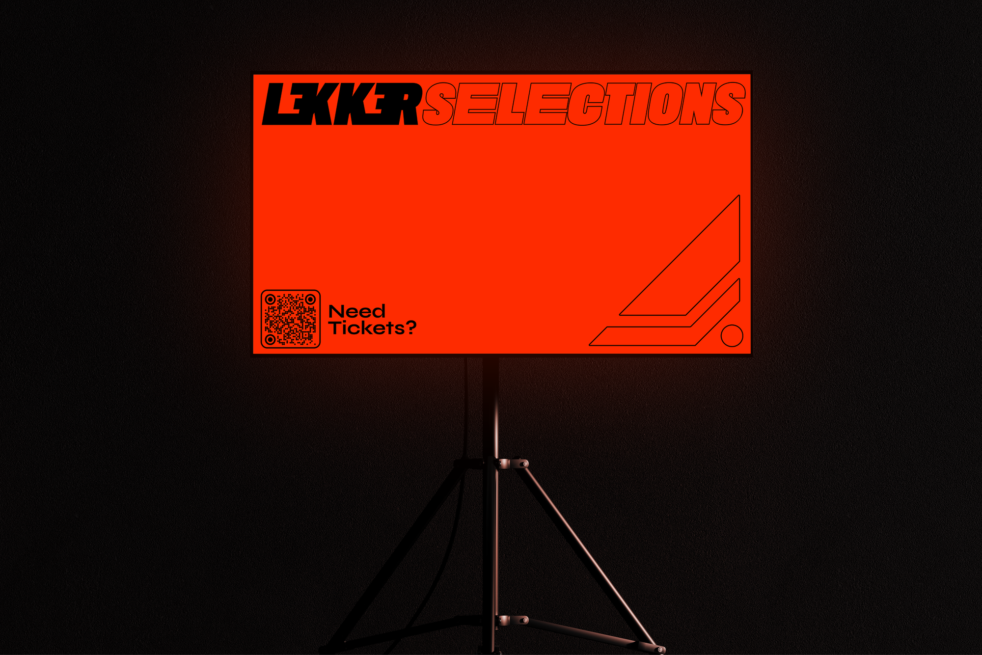
One URL, lekkerselection.com/latest, always points to the next event. When no event is upcoming, it points to the homepage. This lets one printed QR code work forever. The same code goes on every flyer and always resolves to the right page.
Conditional logic
The homepage featured block shows the next upcoming event and hides itself when the calendar is empty. The site sorts events by date and surfaces the correct one on its own, with no manual updates.
Media and performance
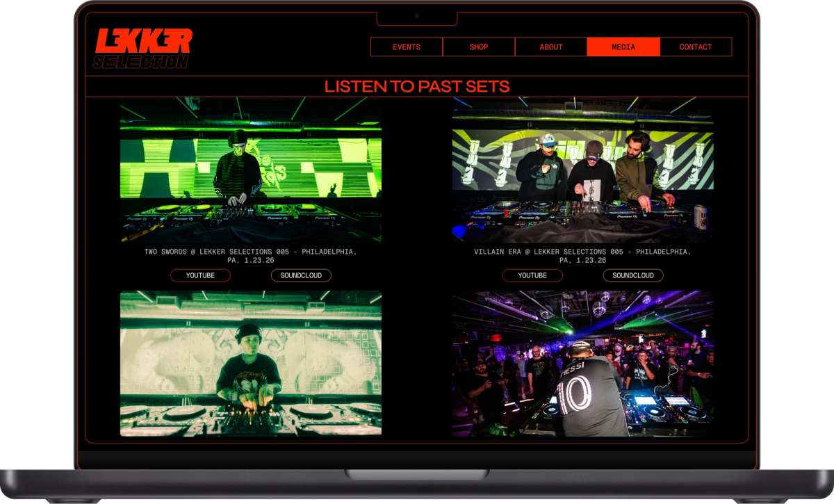
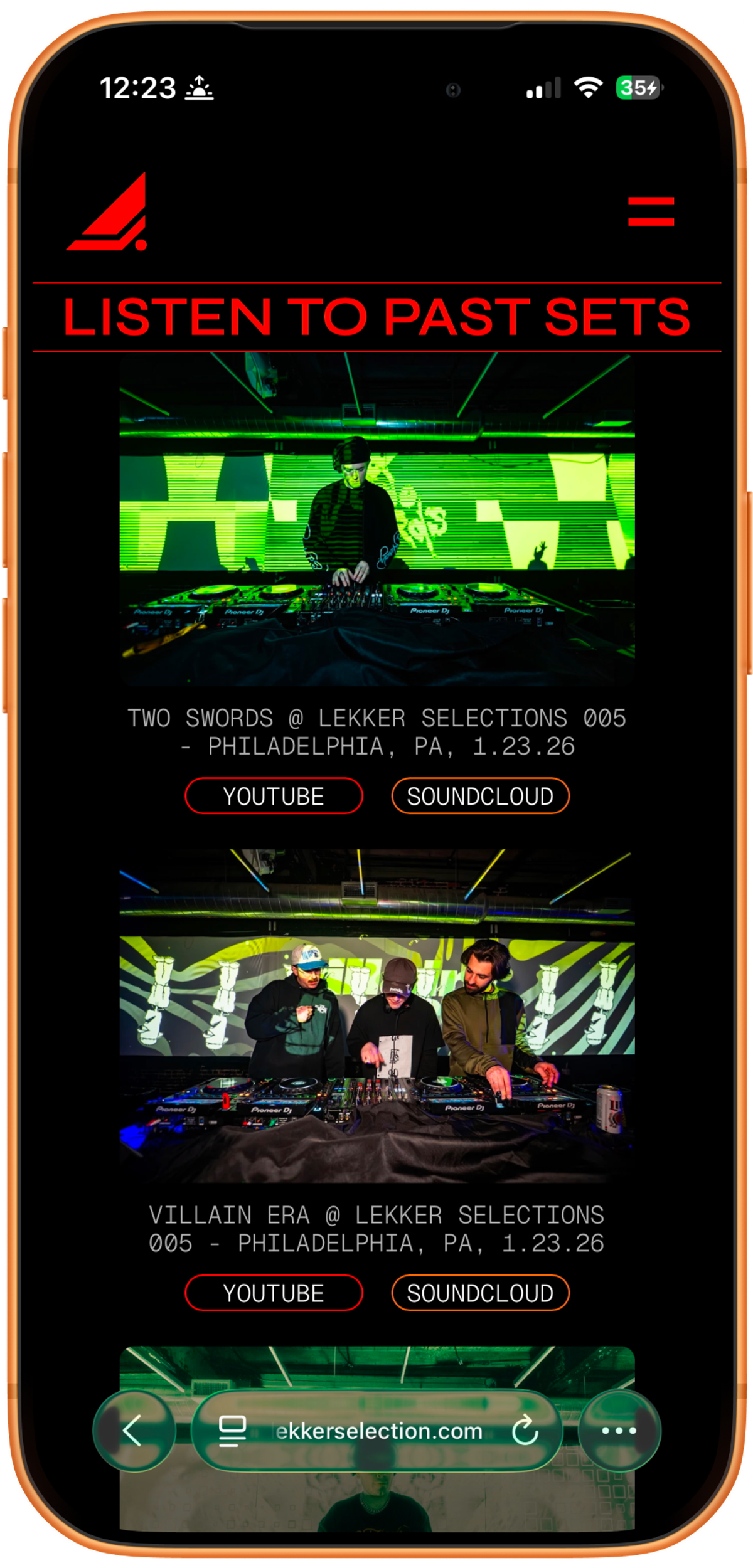
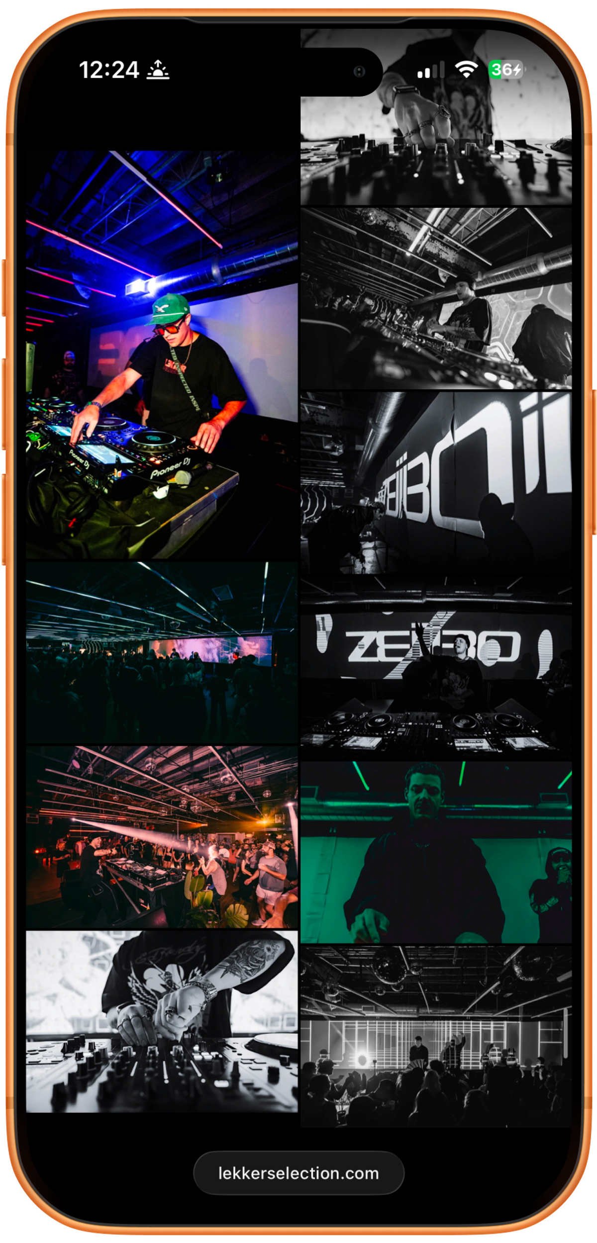
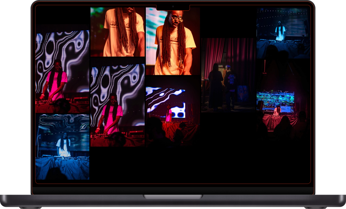
Each event page holds a gallery from the night, plus YouTube and SoundCloud embeds for the sets. A gallery can run to hundreds of images, so I built an image-optimization step. Full-resolution photos convert to web-ready files, which cuts a set from hundreds of megabytes to tens with no visible loss. The pages stay fast on a phone.
Shop (coming soon)
The design connects Shopify to Framer through the Frameship plugin, so the merch will sell on the brand site in the brand style, not on a separate storefront. The shop launches once the client opens their Shopify store.
Handoff
I wrote a handoff guide so the team runs the site without me. It covers how to add an event, add artists, upload and optimize photos, set the /latest redirect for each show, and update the shop once it launches.
The Outcome
A launch that landed
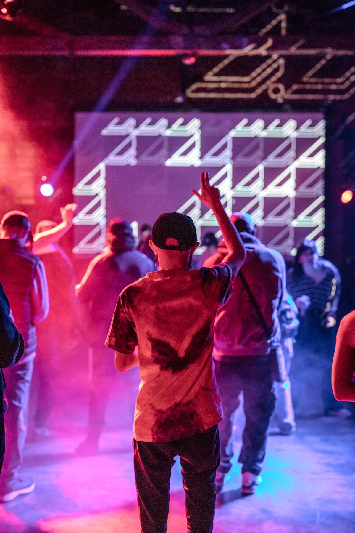
Lekker went live with its first event (LKS001). The brand carried the launch and introduced the company to the city.
A community, not just an audience
The streetwear approach worked. Fans wear the brand and bring it into the scene, which is exactly the goal the founders set.
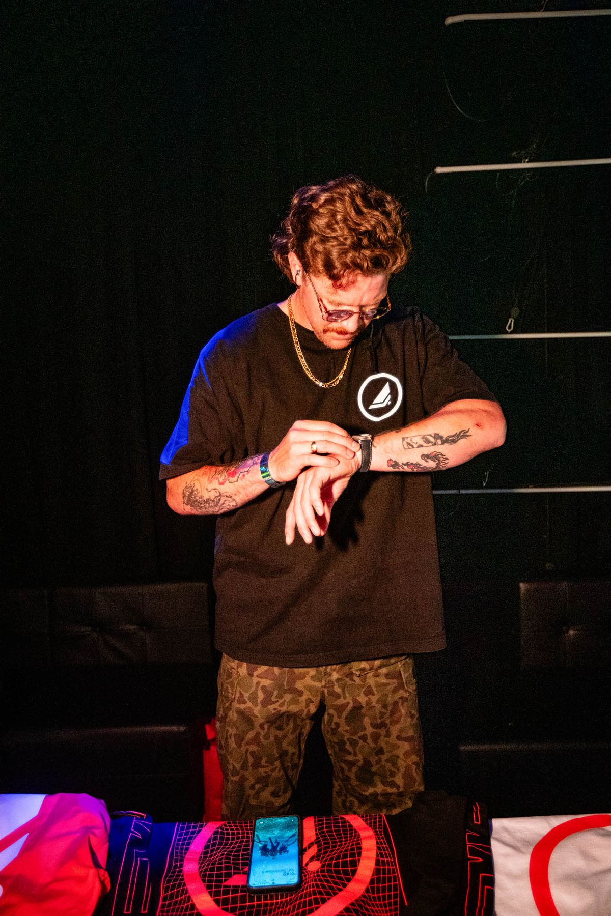
Merch that sells
The merch line is a steady revenue stream and a community driver.
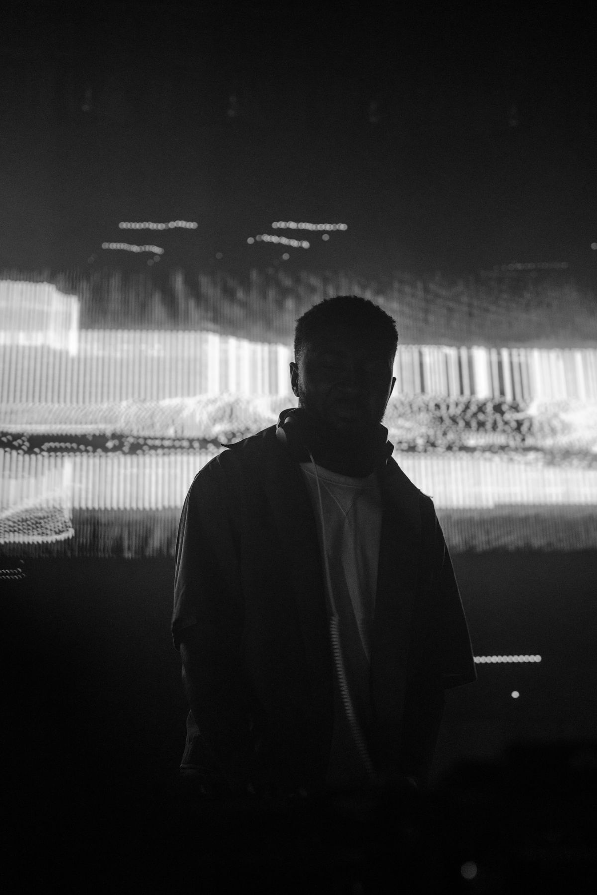
A growing calendar
Lekker has run a full series of shows to strong turnout.
Key Deliverables
- Brand strategy: positioning as a streetwear-style, community-first brand for a company launching from zero
- Brand identity system: logo suite (icon, vertical, horizontal, wordmark) in full-color, mono, and knockout forms; the L3KK3R wordmark; four-color palette; Syne and New Machines type system; brand guidelines PDF
- Texture set: repeating typographic textures in four colorways for flyers, covers, and merch
- Merch: drops built on the wordmark and texture system as the core community engine
- Event system: flyer templates for Instagram, story, Resident Advisor, Facebook cover, and 11x17 print; per-event numbered LKS logos
- Website: mobile-first Framer site with CMS-driven Events and Artists collections, a full homepage scroll, the
/latestredirect, a conditional featured block, media galleries with YouTube/SoundCloud embeds and an image-optimization workflow, a Shopify shop (Frameship, coming soon), and a Links page; plus a team handoff guide - Social: Facebook cover and Instagram templates in brand colorways
Key Takeaway
Launching a company from zero is a strategy problem, not just a logo. The founders wanted a brand people would represent, so I designed the identity to be worn first and built the merch as the community engine. The flyer series gives fans a ritual, and the website gives the brand a home. Every part reuses and transfers, so the brand and the workflow both scale as the calendar grows.